Overview
This was a hackathon project that won the audience award for best project at the second Delphix hackathon of the year in October 2015. For my hackathon project that also won the audience award at the first hackathon in March 2015 and went on to be a full time open source project see Delphix Jenkins Plugin.
The purpose of this project was to experiment with tools that could help improve predictability in sales forecasting. Sales forecasting relies upon numerous inputs including data stored in Salesfore about the status of the deal pipelines as well as the subjective opinions of sales management. This project provided several methods for visualizing data stored in Salesforce to analyze previous sales results.
Data management
Data stored in Salesforce contains such information as the state of the deal at various points in time (there are 6 phases to every deal leading up to either winning or losting the deal), value of the deal, associated company, what product is being sold for the deal, and many other data points. Previous to this project this data had been manually pulled down in Excel sheets and then cleaned up by hand to make it uniform and complete. This project automated the pull down of the data via the Salesforce API then used Python with Pandas and set of rules to cleanup the data.
Visualization
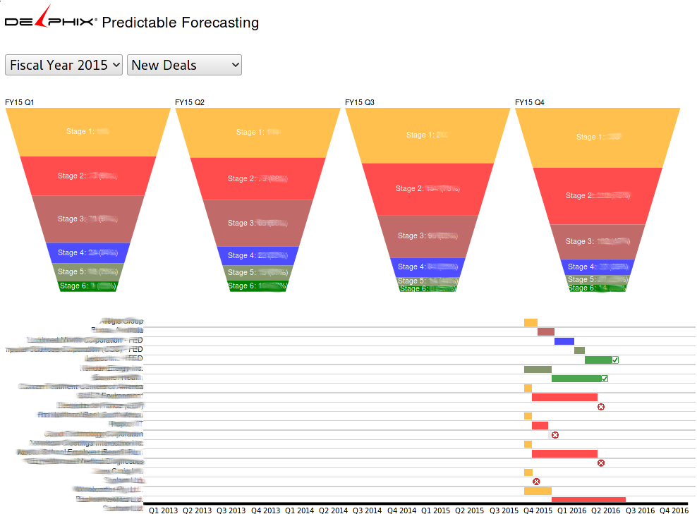
The best way to understand data is to visualize it. Thousands of numbers can be impenitrable but become instantly understandable when graphed. For this visualization the state of deals is shown by customer on a timeline. The state of the deals at different points in time are characterized by the color on the timeline with deals ending in a checkmark if they were successful, red X if they were not, and otherwise still in progress. A deal on the timeline can be hovered in order to bring up additional information about it. Since there are so many deals a few filters are provided. The data on the timeline can be filtered by fiscal year and deal type (new customer or renewal). Each quarter of the fiscal year has a funnel that shows the state of deals as the progress from there initial stage (all deals) through the deal pipline until the final state of closed. Clicking a funnel filters the timeline to show only deals for that quarter. This method of visualization with progressive drill down helps users to quickly understand the data and gain insights that wouldn't be possible by looking at tens of thousands of rows of Excel.
Technology
- Python with Pandas for data parsing on the backend
- D3.js for visualization